Microsoft Design Week event portal
Every year, Microsoft's greater design community comes together for Design Week, the largest internal celebration of creativity, craft, and design culture.
Over 4,000 designers, researchers, writers, and "makers" gather across eleven global hubs from Redmond to Mexico City to Bangalore. It's a big deal. And the event portal is the face of the event, if you will. The portal that holds it all together, the place where you find your sessions, discover speakers, and feel the pulse of the event, really needed to reflect the momentous shift to new tech.
When I was nominated to the Design Week leadership committee, I could have taken on a safer role. The portal was a known headache because it crashed under load, had serious accessibility issues, was hard to navigate, and honestly didn't reflect the quality of the community it was meant to serve.
What followed was the most expansive (and fun!) project I'd taken on. Redesigning this portal allowed me to be a designer, a brand director, a content strategist, a project manager, and a volunteer coordinator.
Finding the theme


Before I touched a single design file, I needed to answer the harder questions: What should this event mean right now? What does the design community need?
AI was arriving fast and loud, and the design community was feeling it. There was real anxiety underneath the excitement about relevance, about replacement, about whether the skills we'd spent years building still mattered. Design Week couldn't ignore that. It had to speak to it. I pitched several theme directions to the committee.
The one that resonated was coevolution. Coevolution is a concept from nature. The way species develop in response to each other over time, each shaping the other's evolution. I believed it was the right lens for this moment. We weren't being replaced by AI. We were being changed by it, and we had a choice about how.
By working together (humans and technology, designers and systems) we could build something bigger than either could alone. We could envision new skillsets, foster bigger ideas, and become builders ourselves. The fear of being replaced could become the fuel for rising to the occasion.
Building the brand

I wrote the design brief and directed the visual identity in collaboration with a branding team. The creative direction had to do two things: honor where the design community came from, and point confidently toward what was next.
We landed on a retro-meets-futuristic aesthetic that includes vintage keyboard keys and old devices sitting alongside cheeky illustrated characters, happy faces, and playful symbols. There is a focus on bright, textured color. We used subtle animations that made the experience feel alive rather than static. The tone was warm and a little irreverent. We wanted joy and optimism, not a corporate announcement.
The brand also had to work beyond a screen. We designed with event merch in mind (tote bags, enamel pins, t-shirts) and that constraint actually sharpened the visual identity. If it works on a pin, it works everywhere.
Designing the experience
Once the brand had a direction, I turned to the content and structure of the portal itself. Supporting 150 speakers and 75 sessions across a global event is a real information architecture challenge, and the old site had no real answer for it.
I started by interviewing previous chairs to better understand the general constraints that have prevented improvements in the past. Then I met with previous event attendees, and I reviewed last year's event feedback, to better understand user expectations.

Early brainstorming and mapping potential solutions.
I prioritized the following functional improvements:
-
I added a tagging system to the sessions page so attendees could filter by topic and find what was actually relevant to them.
-
I pushed for state-aware buttons on each session so you could see at a glance whether something was upcoming, currently active, or available as a recording.
-
I added an About section for people who were new to Design Week entirely, because every year there are thousands of people attending for the first time who have no context.
And we added more design improvements too like an interactive counter on the homepage that gave the event its sense of scale right from the start. Every one of these was a small decision. Together they added up to an experience that respected people's time and felt worthy of the event it was representing.
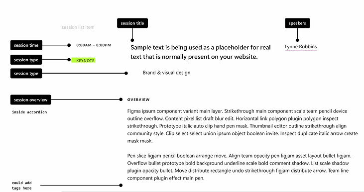
These are the design and content components for the new session pages.

Details for the tagging strategy and state-aware buttons on the schedule page.

The schedule page mocking up the various categories and states.
This is the phase where I started working on the new content for the website, using the guiding principles from the theme. I built a brand narrative, coevolution, that named the anxiety directly and gave people a reason to lean in instead of brace, then carried that idea through a headline, a mission statement, and dozens of pieces of supporting copy so it held together everywhere someone encountered it. It's internal work, but the underlying problem, turning real anxiety about AI into language that actually lands, is close to what most AI companies are trying to solve in public right now.
Here are a few snippets of content that made it to the portal:
"Zooming in on the intricate dance of adaptation and change. Co-Evolution emerges as nature's ultimate choreographer, orchestrating the development and refinement of species over countless generations. It's a captivating narrative of life's continuous journey towards improvement and adaptation."
This extends the coevolution metaphor from a headline into a full paragraph without it feeling forced, "ultimate choreographer" keeps the nature metaphor concrete instead of drifting into abstraction.
"Amidst the allure of algorithms and the promise of automation, let's never forget the cornerstone that lends gravity to our craft: our focus on the human experience and our ability to evolve."
This line compresses the whole event's thesis into one sentence, it names the anxiety around AI directly instead of avoiding it, then redirects to what doesn't change.
"With AI and new interaction paradigms, learn how UX Research, Design, and Content can work together to create experiences that address user needs, build habit, and drive delight."
Three concrete outcomes instead of a vague promise of "great experiences," giving someone an actual reason to click into the session.
Making it real
The redesign touched everything — front end, back end, interactions, animation, accessibility, content.
The old portal had real problems: performance issues that caused crashes when traffic spiked, accessibility complaints that had followed it for years, an experience that made it harder to find things than it needed to be. A patch wasn't going to fix any of that. I worked with a visual designer I recruited and a small engineering team to start over.
On top of the build, I ran the content operation: recruiting a team of volunteers, dividing the data entry work across 150 speaker profiles and 75 session entries, establishing quality checks, and making sure everything was accurate and live before the event opened.
Before

After

New - About page

How it landed
The portal supported 4,000+ designers across 11 global hubs accessed the portal without a single crash. The portal got ~10k views in the first week.
The portal wasn't the event but it made the event possible. The event feedback was specific in a way that mattered. Event attendees called out the portal by name - "The website was awesome," "Loved the website that made finding sessions and recordings so easy." "I appreciated having the recordings available the same day."
What made me happiest was that the following year's team built on the same foundation. New branding, but the same site. Knowing it was durable enough to hand off year over year was rewarding.

What will stick with me
I took on something ambitious. I had never run a project at this scale before, and I had to figure out how to lead without always knowing what came next.
I had to write a brief, direct a brand, manage a small team of volunteers, coordinate with engineers, make a hundred content decisions, and keep the whole thing moving while also being a first-time committee member trying to earn the trust of people who'd been doing this longer than me.
I'm proud of the portal but I'm more proud that I chose the hard thing.
