Content coherence for the Viva suite
Microsoft Viva is a suite of 8 apps that launched during a disruptive period in enterprise software history. The work-from-home movement that boomed during the pandemic changed the way we thought about designing employee experiences. Some apps joined the suite through acquisitions, some through rebrands, and all of them were created by different designers. And for a while, that was fine. We were moving fast and building something new.
But as the suite grew, the seams started to show.
The coherence problem
Research and design reviews were surfacing a consistent signal: that shared experiences, UX controls, navigational elements and content felt unfamiliar from app to app. Navigation was confusing, menu labels were erratic, and features were hard to discover. The value of the product was getting buried under overly complicated enterprise jargon and inconsistent content patterns.
The suite needed a shared foundation, not so everything looked the same, but so the real differentiation of each app could shine through in a way that feels familair and consistent across Viva app experiences.

Example of results from the first Viva content coherence session
Content strategy that helped inform voice and tone
Building something from nothing
I was deliberate about where we focused first. I chose areas where content designers had real influence and could move quickly without needing a lot of organizational approval. Things like menu labels, system messages, onboarding patterns. Quick wins we could ship without creating too much engineering work.
Some sessions were tightly structured workshops. Others were more open, just a space to share problems, compare approaches, surface things worth discussing. Over time the sessions got richer. People started bringing better questions and more concrete examples. Other disciplines started showing up like visual designers and technical writers who were curious about what was happening.

Voice and tone workshop with Content design representatives from each Viva app.
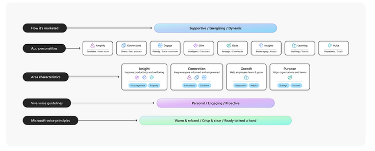
One of our first deliverables was to consider how Microsoft voice guidelines could be dialed up or down to fit the unique needs of Viva. Viva's value prop was to be energetic and engaging, which gave us some creative freedom to rethink what our customer-base needed. We didn't want to complicate the Microsoft's long-standing voice guidelines, but instead we wanted to evolve them.

Viva voice principles dial up and turn down certain existing Microsoft voice guidelines.
The existing guidelines gave us the baseline dial settings: ready to lend a hand, crisp and clear, and warm and relaxed. From there, we layered in three Viva-specific principles meant to augment Microsoft's voice, not replace it:
-
Personal: We speak directly to the user to create purpose and meaning that empowers people.
-
Engaging: We prioritize action, progress, and momentum, making experiences trustworthy and easy to use (and worth coming back to).
-
Proactive: We anticipate needs and lend a hand, taking an active role in each person's success to make work and life easier.
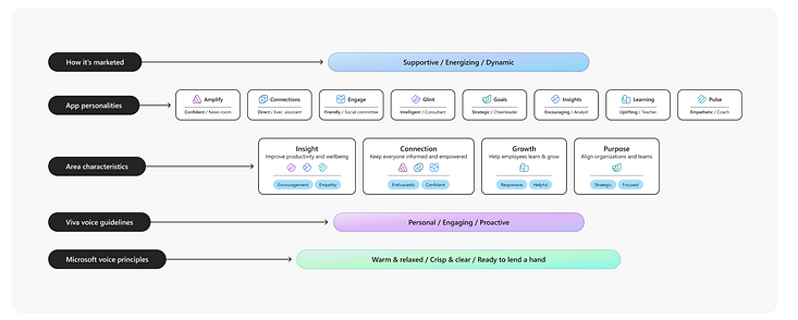
Each Viva app can stand on its own individually, in addition to fitting neatly within a family of related apps.
Once tone decisions lived in a shared framework, Content designers could more confidently and strategically improve content in their assigned areas. The thinking was a quick content change that gets included in the current sprint can be really valuable when you need to improve quickly rather than needing a design review or worse, getting put on the engineering backlog. This work also meant every app was being evaluated through the same strategic lens instead of individual judgment app by app, turning voice decisions into a systematic practice instead of a one-off call each time.
Here are a few before and after examples that demonstrate how we applied the voice principles across various kinds of touchpoints.


The kit
Everything we worked through over that year needed a home, so I captured it in a design kit that served as an extension to our foundational Fluent design system. The kit was designed to pull out what actually mattered for this specific context and make it easy to use for both the content designer and other design partners. It also became the first thing a new content designer stepping into this space would read. It made a lot of invisible decisions visible.
We organized the work around three problem areas - known content issues, Content design heuristics applicable to Viva, and Viva-specific opportunities like onboarding experiences.
Known content issues
Small, recurring mistakes, inconsistent capitalization, misused pronouns, missing "please" and "thank you" moments, were showing up across the suite. We documented the pattern with clear do's and don'ts so any team could spot and correct it without waiting on a content designer to catch it in review.


The after is more direct and less apologetic, and it clearly states the one action available. These qualities make the message easier to act on and create a better experience for the user.

The after is shorter, more scannable, and more direct. Together, these qualities make the message easier to read and create a better experience for the user.

The after is simpler and more user-focused, and it clearly states what to do next. These qualities make the message easier to understand and create a better experience for the user.
Content design heuristics, made Viva-specific
Generic content design principles exist, but they don't tell you how to apply them inside Viva's context. We translated heuristics like scannability, confidence, and customer-centricity into Viva-specific guidance backed by real before-and-after examples pulled from our own product. Having that captured meant content designers could point to a documented standard instead of relitigating the same argument in every design review, which shortened debates and sped up decisions.

Viva-specific components and opportunities
Some patterns were unique to how Viva worked. First run experiences, or onboarding experiences, is one of the clearest examples. We knew that if people didn't understand how to engage with a brand-new kind of experience in their first few seconds, they wouldn't come back, so getting onboarding right became its own focused area of the kit.
.png)
What it produced
The kit was showcased in our studio newsletter and socialized across product design teams. The response was immediate and practical. Designers said it helped them cut through the noise, move faster, and make better decisions.
At its height, the toolkit was being used across 8–12 product teams with 40+ designers and content designers working from shared guidance that simply didn't exist before.
The deeper value was consistency and fewer recurring debates in design reviews about foundational decisions, less content rework late in the process, and a cleaner path for new content designers stepping into the space for the first time.
What I'm most proud of is that the people working on these experiences became more thoughtful. The sessions, the kit, the community all legitimized the discipline in a way that mattered and helped our studio be seen as a multifaceted, strategic function rather than just a writing resource.
The work also got me promoted. My manager cited my cross-team influence and my ability to make complex, invisible work visible and tangible across the organization.
What I learned
Systems work is heavy. There's a lot to sort through, and most of it doesn't come with clear before and after pictures. You're making decisions that are easy to overlook and hard to undo.
What I learned is that the most valuable thing you can do with that kind of work is make it make sense for both the system and the user. Document it. Socialize it. Give people a way to hold onto it and build from it. The kit isn't just a reference guide. It's proof that the thinking happened and an invitation for the next person to keep going.

Fast-forward 3 years later: If I were to do it again, I would document the most important content patterns and requirements in system files that could be ingested by a larger AI design system to scale expertise and contribute to the design system's knowledge base.